
The Psychology of Color: How Your Home's Palette Impacts Your Mood
Creating a harmonious and mood-enhancing environment through color selection is a crucial aspect of interior design. As an interior designer, understanding the psychological impact of color can help you craft spaces that not only look aesthetically pleasing but also promote desired emotional responses from those who inhabit them. Here’s a professional exploration of how color palettes can influence mood and enhance the ambiance of a home:
The Influence of Warm Colors:
Red
- Psychological Effect: Red is a powerful color that evokes energy, passion, and excitement. It can stimulate conversation and appetite, making it an excellent choice for social spaces.
- Design Application: Use red as an accent in dining rooms or living areas to create a dynamic atmosphere. Be cautious with its intensity, as too much red can be overwhelming.
Orange
- Psychological Effect: Orange exudes warmth and enthusiasm. It can inspire creativity and social interaction.
- Design Application: Incorporate orange in entryways or creative workspaces. It adds vibrancy and can make a space feel welcoming and energetic.
Yellow
- Psychological Effect: Yellow is associated with happiness, optimism, and light. It can brighten spaces and elevate mood.
- Design Application: Ideal for kitchens and breakfast nooks, yellow can create a cheerful and inviting environment. Use softer tones to avoid overstimulation.
The Calming Effect of Cool Colors (My Favorites):
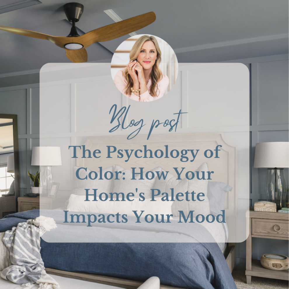
Blue
- Psychological Effect: Blue is known for its calming and serene qualities. It can reduce stress and promote tranquility.
- Design Application: Use blue in bedrooms and bathrooms to create restful retreats. Lighter shades enhance relaxation, while darker blues add depth and sophistication.
Green
- Psychological Effect: Green is synonymous with balance and renewal, echoing the peace found in nature.
- Design Application: Versatile and soothing, green can be used in any room. It fosters a sense of calm and can be particularly effective in home offices and living areas.
Purple
- Psychological Effect: Purple combines the stability of blue and the energy of red, often associated with luxury and creativity.
- Design Application: Light purples such as lavender work well in bedrooms for a restful effect, while deeper purples can add a touch of elegance and drama to formal spaces.
Neutral Colors for Versatility and Elegance:
White
- Psychological Effect: White conveys cleanliness, purity, and spaciousness. It provides a blank canvas that can be styled in numerous ways.
- Design Application: Use white to create a sense of openness and clarity. Pair it with bold accents for contrast or soft hues for a minimalistic aesthetic.
Gray
- Psychological Effect: Gray is sophisticated and calming, offering a neutral backdrop that complements other colors.
- Design Application: Ideal for modern and contemporary designs, gray adds understated elegance. It works well in living rooms and bedrooms, providing a chic and timeless look.
Brown
- Psychological Effect: Brown suggests stability and comfort. It brings warmth and earthiness to a space.
- Design Application: Use brown to create cozy and inviting environments in living rooms and libraries. It pairs well with natural materials like wood and leather.
Expert Tips for Color Selection:
- Purpose and Functionality: Consider the intended use of each room and choose colors that align with its purpose. For instance, calming colors for bedrooms and stimulating hues for social areas.
- Balance and Harmony: Achieve visual balance by combining colors that complement each other. Use contrasting tones to create focal points and add visual interest.
- Lighting Considerations: Test colors in different lighting conditions to understand how natural and artificial light affects their appearance.
- Client Preferences: Tailor color choices to the preferences and lifestyles of your clients, ensuring that the spaces resonate with their personal tastes and emotional needs.
By integrating these color principles into your design strategy, you can create interiors that not only reflect your client’s style but also enhance their quality of life through the strategic use of color psychology.